Tim Burton uses a lot of divisions of space in his piece. By utilizing household structures such as: bed posts, basement pipes, doorways, and windows and even mirrors to create divisions of space. These divisions appear to lead the viewer into another place that we can't completely see, it helps to emphasize the idea of the co-existance between two worlds, one we can plainly see as the living and one we struggle to understand - the dead.

A lot of divisions occurring at once!
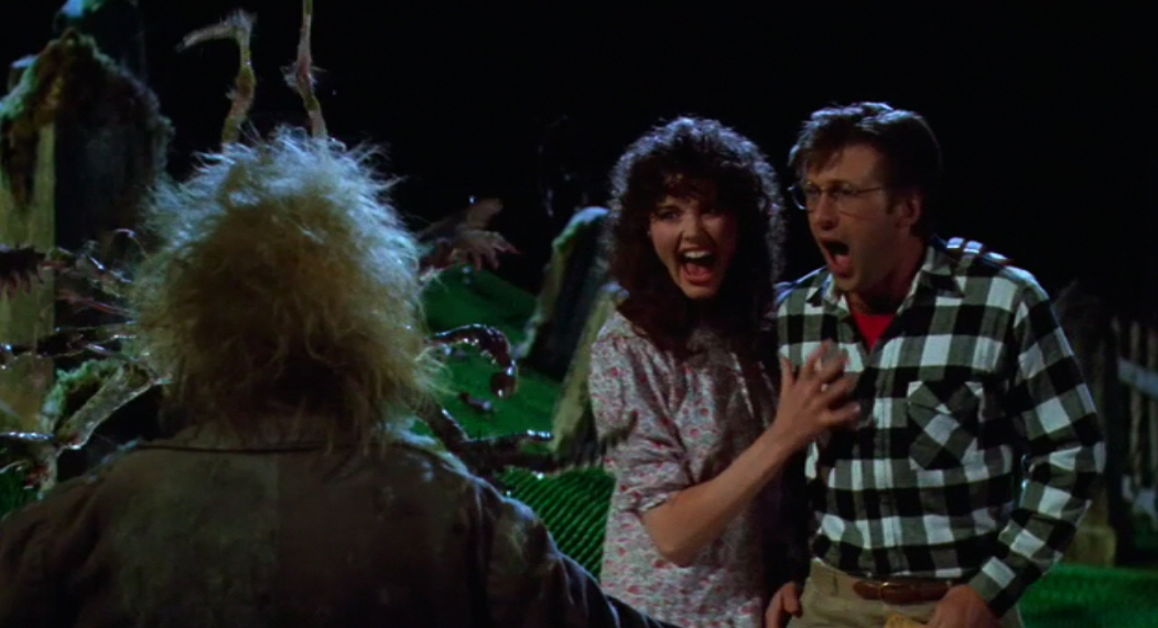
He lets his moving characters to control the camera movements, he doesn't usually allow them to completely move out of frame. Instead he moves with them, when they engage in conversation he focuses on one, leaving the back of the other one to dominate the empty portion of the frame. This abstracts the individual whose back is to us, because he focuses in on the facial expressions and movements of the other person. The individual with a back to us, is nothing but an out of focus mop of colors and patterns. Usually the out of focus person is listening to the person doing the engaging.

He does use close ups a few times within this film. Often times to indicate significance for instance, after the Maitland's die, he focuses in on three separate but very linked items. The cuckoo clock as it dings, the Handbook for the Recently Deceased, and the obituary as Beetlejuice thumbs through the Afterlife News.

Beetlejuice's number at the end of the film
When the Maitland's are alive Tim uses natural light, and the sounds are voiceless but very up beat and happy in tune. Once they die, he quickly begins experimenting with filters rose, and blue to be specific. He uses rose as Adam Maitland opens the door to attempt to exit the house. He then switches to blue as Barbara grabs him and brings him back from Jupiter. The music also becomes more dramatic with the usage of trombones. Because of this the lighting also becomes really dramatic when engaging other ghosts or using anything within the realm of the "Afterlife."


A filter!

Another!
Tim also likes to use hands or external environments to change from scene to scene.
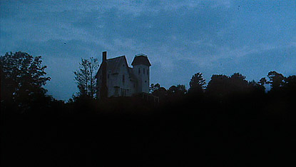
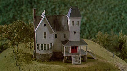
He uses Adam's hands in the very beginning when he is scooping the spider off of the model town. He uses Barbara's hands to indicate cleaning as the attempt to discover the contents of the Recently Deceased. Or after the Maitland's try to get the attention of the landlord, and fail. He exits the scene by showing the car driving off of the property. When he uses external space, after the die, it is always a shot of the house they are trapped in.

The model house in the beginning
Whenever people are placed together in a space, he makes sure they are on separate planes which helps to indicate depth. So one may be laying down as the other is standing and pacing in the same shot, or one may be at the top of the stairs and the other in a door way at the bottom. It creates this illusion of the characters rarely being on the same plane - if they are on the same plane, there is a third person present to reflect the depth. Which goes back to the core idea of the film between the living and the dead, as separate, but co-existing planes.

It is also rare to see the 'living' characters from the waist down, he keeps most of the shots as profiles or movements of the individuals. There are scenes where he backs up and allows you to see the characters slumped over chairs or walking into doorways. They almost float from frame to frame. He also, at times, continues a dialogue into the next scene, which creates an eerie disembodied feeling.
No comments:
Post a Comment